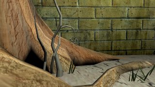
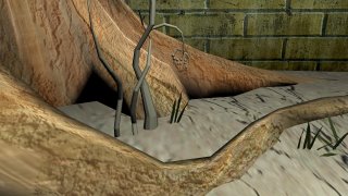
organic scene.

 i dont know why im posting this. but since i am..Which composition do you like better? And...yes, friendly unknown reader, its due today. Theres a slight difference, i didnt have the camera positioned for the lower one..so i cant get that exact render again..but, i could. THese things are the things that slow me down even more.
And..i think this scene, is terrible. i like the colors..and like the tree's roots that way..but..Its still terrible. buut..its like... few hours of work..I think. I can never keep correct count.
ANd, NO, its not done.

2 comments:
i think i'd have to go with the first one. i think it has the illusion of more detail idk.
I know its a little late, but I do like the first one better as well, the wall on the back ground help the balance the composition. now if you make the root in the forgound looking really nice it ll look even better. yes lighting in 3d is hard. well, not hard it just that you have to set there and spend hours or even days tryign to get it to render righ, but with great lighting it can turn a so so scene into a work of art. keep trying.
Post a Comment